Responsive Web Design (RWD) is a web design approach that makes a website automatically adjust its layout, images, and content to fit different screen sizes and devices such as desktops, laptops, tablets, and smartphones.
Why Responsive Web Design Is Important
A responsive website:
- Provides a better user experience on all devices.
- Improves website loading and usability.
- Helps with SEO (Search Engine Optimization).
- Reduces the need for separate mobile and desktop websites.
- Increases visitor engagement and conversions.
How Responsive Web Design Works
Responsive web design uses:
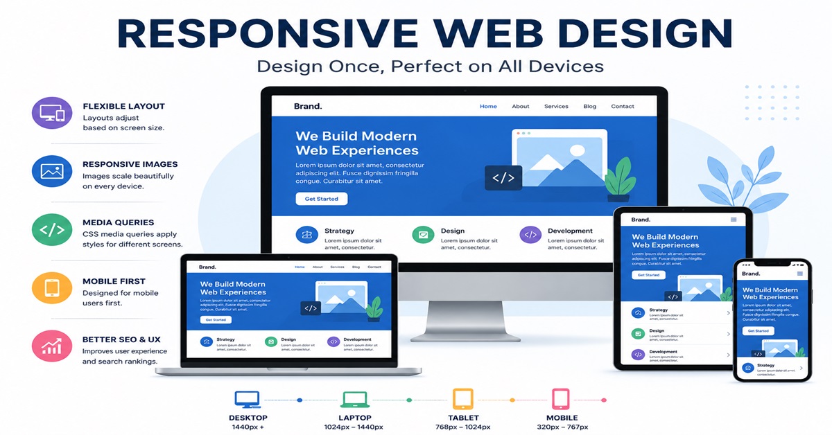
1. Flexible Layouts
Elements automatically resize according to screen size.
<div class="container">
  <div class="content">Content Here</div>
</div>
.container {
  width: 100%;
}
2. Responsive Images
Images scale without overflowing the screen.
img {
  max-width: 100%;
  height: auto;
}
3. Media Queries
Media queries apply different styles based on screen size.
@media (max-width: 768px) {
  body {
    font-size: 16px;
  }
}
Example of Responsive HTML Page
<!DOCTYPE html>
<html>
<head>
<meta name="viewport" content="width=device-width, initial-scale=1.0">

<style>
body {
    font-family: Arial, sans-serif;
    margin: 0;
}

.header {
    background: #007bff;
    color: white;
    text-align: center;
    padding: 20px;
}

.container {
    display: flex;
}

.box {
    flex: 1;
    padding: 20px;
}

@media (max-width: 768px) {
    .container {
        flex-direction: column;
    }
}
</style>
</head>

<body>

<div class="header">
    <h1>Responsive Website</h1>
</div>

<div class="container">
    <div class="box">Section 1</div>
    <div class="box">Section 2</div>
</div>

</body>
</html>
Common Screen Sizes
| Device | Width |
|---|---|
| Mobile | 320px – 767px |
| Tablet | 768px – 1024px |
| Laptop | 1025px – 1440px |
| Desktop | 1441px and above |
Best Practices
- Use the viewport meta tag.
- Design mobile-first.
- Use flexible grids.
- Optimize images.
- Test on multiple devices.
- Avoid fixed-width layouts.
Conclusion
Responsive Web Design ensures that a website looks and functions properly on every device. By using flexible layouts, responsive images, and CSS media queries, developers can create modern websites that provide an excellent user experience across desktops, tablets, and smartphones.